Green Roof Monitoring
This page shares some of Green Roof Diagnostic's monitoring of field performance of green roofs. Our facility has four platforms where we monitor a wide range of green roof conditions, including rainfall, runoff, retention, drainage, air temperatures, soil temperatures, and evapotranspiration.
This page shows raw, unprocessed, un-analyzed data, and as such, this data is not suitable for any purpose other than just sharing some of our ongoing activities. But even before analyzing and filtering out errant measurements, some trends are very apparent.
Monitoring of actual green roof performance is central to Green Roof Diagnostic's activities. Outdoor platforms, exposed to the elements, provides necessary context for laboratory tests, and is a critical element in quantifying evapotranspiration.
Quick Green Roof Monitoring Tutorial
Check out the video about our monitoring data. We'll show you briefly what the platforms look like, how to search monitoring data on this page, and how to read the graphs.
If you have any questions about this, please click "Contact Us" in the footer of this page.
Monitoring Search Console
To see actual monitoring data, select up to 3 events from the list below. Then click the magnifying glass icon. A graph then appears over a full-screen, dark gray background (for visibility).
Navigate to the next event, or prior event, by using the left and right arrows at the bottom of the graph.
Check out the video above for more information!
Monitoring Data and Graphs FAQ
Most of the information below is in the video, if you'd rather watch than read.
What do these graphs show? Above is a fairly typical example. We currently have four (4) platforms, so there are five (5) lines on the screen: rain is solid blue, and the four other lines are runoff from the four (4) platforms.
The X axis (horizontal axis) is time in an hourly timestep, from oldest (left) to more recent (right).
The Y axes (vertical axes) are quantification. The standard graph settings above show inches per increment, and decimal percent. Inches per increment of the blue line is rain in inches per hour, and for the other lines it is runoff in inches per hour. Decimal percent just means 0.2 is 20%, 0.5 is 50% and so on. For more about this, see "What are the dots on the left margin of each graph?" below.
Here is a plain English explanation of the graph above: During this rainfall, there were two peaks, with the first peak at around 0.2 inches of rainfall per hour, and the second peak at around 0.40 inches per hour. Throughout the rain event, the control roof produced runoff at a rate almost identical to rainfall rate. The traditional green roof started off moist, with a VWC of about 22%, which is about 63% of its ASTM theoretical maximum saturation. The other two green roofs started off rather wet, with VWC of about 47-50%, which is about 95-105% of their ASTM theoretical maximum saturation.
The rather dry traditional green roof delayed initial runoff by approximately 2 hours, at which point runoff occurred at a rate approximately equivalent to rainfall, with peak runoff reduced by approximately 8%. The other two green roof profiles delayed initial runoff by nearly as much, but reduced peak runoff rate by 22% and 37%.
How do I navigate these graphs? See the example above. You can hover over any vertical line or data point to see numerical values at that point in time. The icons at left include some layer pre-sets to display other data points (such as temperature and evapotranspiration). Use the left and right arrows to change events. Exit the graph by clicking the X at top.
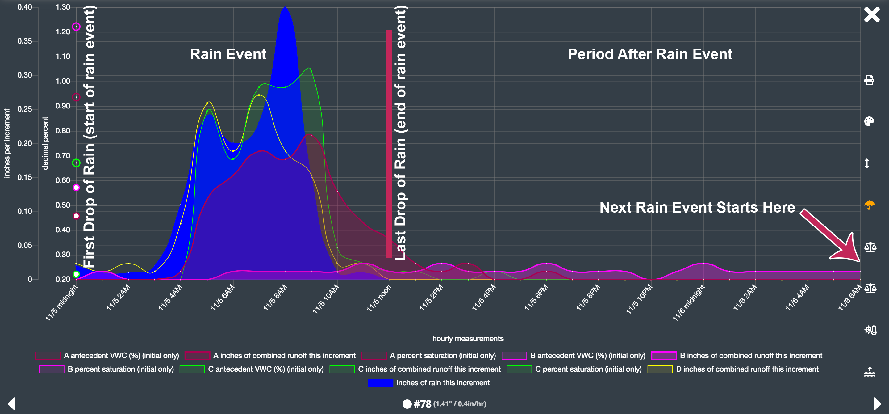
What is an event? See the selector list farther up on the page. Each row in this selector list is a "rain event". We use the common definition of rain event, which begins when the first drop of rain falls, and which ends when no rainfall has occurred for at least 6 hours. Unless you check the box "show only rain events", the graph will also show the period following a rain event, before the next event starts. This "dry" period can be important for observing drainage after the rain stops.
The graph above illustrates this concept. The lefthand side of the graph is the rain event, distinguished by the presence of rain (the solid blue line). The righthand side of the graph is the period after the rain event, distinguished by the absence of rain. The rain event begins at the very far left of the graph, when the first drop of rainfall is detected. The next rain event (#79 in this example) begins immediately after this graph, in this example on 11/8/2018 at 7AM.
What is the significance of the event numbers? Each event receives a sequential number. Our event numbering system starts with #1 in late March 2018. There is no significance beyond that. Since rain events are very site specific, there is no universal numbering system for events.
What is the "peak in/sf/hr" column in the selectors? That column indicates peak rainfall intensity per hour. (Later we will add peak intensity per 6-minute period.) This corresponds to the tallest peak of the blue line on the graphs. Green roofs and soil absorb water more efficiently during lower-intensity rainfalls. One of the things we are monitoring is which systems absorb water more efficiently during intense rainstorms.
What is the hrs column? The hours column is the number of hours of the rain event. These hours do not count the time between events. In the example image 2 questions prior, the hours corresponds to the timespan between the far left edge of the graph and the vertical red line when rainfall stopped.
What are the dots on the left margin of each graph? Each graph illustrates antecedent moisture conditions at the far left of the graph. Antecedent conditions are just the conditions preceding the event. These measurements let us know how wet or dry the green roof was before rain began, which is a major area of our research focus. Specifically, we are studying which green roof systems continue to absorb (retain and/or detain) water even when substantially saturated.
There are two sets of dots in the left margin. The smaller, solid-center dots represent volumetric water content, i.e. the volume of the green roof profile that is occupied by water. Depending on green roof profile, these measurements range from 0.1 (10%) to about 0.4 (40%), sometimes up to 0.6.
The larger, open-center dots represent how saturated the profile is in contrast with the theoretical ASTM maximum saturated value. (We've written a technical bulletin about these common ASTM tests.) These numbers may be anywhere along the axis, but in most profiles the numbers range from 0.2 (20%) to 0.7 (70%) and in some profiles exceed 1.0 (>100%).
In the example graph below, the platform C had an initial VWC of 16% (50% of that profile's ASTM maximum saturation, platform B had an initial VWC of 49% (104% of ASTM), platform B had an initial VWC of 41% (85% of ASTM).
Why do some of these events show almost nothing on the screen? The monitoring data we show is raw, unfiltered, pre-analysis, and quite often a tiny rain event registers, which looks insignificant on the screen. Rain events of less than 6mm or about 0.25 inches do not usually produce very interesting graphs. The image below shows a rain event of only 0.04 inches, which obviously remains a valid rain event, but which produces a rather empty looking graph. We usually learn the most from graphs of big storms!
Can I adjust the axes? The Y axes of each graph are normalized so that each event is easily compared with other events. However, sometimes this means that very large events exceed the screen, or very small events are hard to see. Click the up-down arrow icon in the right margin to toggle the Y-axes to auto-fit. Currently the X-axes are fixed, with only 2 options: include dry period after rain event, or exclude it.
What do you do with this data? We use this data in a variety of ways, including quantifying evapotranspiration, parameterizing performance characteristics, confirming applicability of data from laboratory tests, observing performance in erratic weather, and observation of detention several hours or days after a rainstorm.
How often is this updated? Every time it rains. We collect monitoring data as frequently as every minute. As soon as a new rain event starts, data from the prior event is automatically processed and posted to this page. If this is really interesting to you, let us know, and we could potentially email you when a new graph is available.
How does this data differ from analyzed data? During analysis we follow a standard scientific process of eliminating bad data points, identifying trend lines and margins of error. Bad data points are usually due to equipment maintenance or malfunction. Each graph lists a very brief summary of the event, and identifies things such as platform down for maintenance, etc.